Why relaunch the online Carnegie Mellon responsive university magazine when it was relaunched just two years ago? Two reasons: big data & branding.

Why relaunch the online Carnegie Mellon responsive university magazine when it was relaunched just two years ago? Two reasons: big data & branding.
The statistics are rather unsettling. The National Cancer Institute estimates that 1,658,370 new cases of cancer will be diagnosed in the United States in 2015 and 589,430 people will die from the disease. I wrote about my own cancer scare years ago for the Pittsburgh Post-Gazette and I always thought I could only fight cancer […]
Over the past few years, the web industry has been very focused on devices. So much so that responsive design is defined as “building web content that shows up well on any device.”But focusing on devices isn’t enough anymore. By focusing only on devices, we are missing other experiences. Our web content is no longer […]
We recently launched the William Woods University website with the thought that it might be touted as one of the best responsive design college websites. Our guidelines were simple: 1. Authenticity 2. Simplicity 3. Integrity 4. Findability 5. Usability 6. Beauty How did we do? What do you think? and in responsive mode Visit the […]
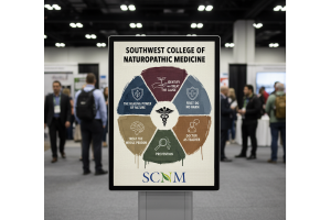
Elliance is proud to launch the first responsive website for naturopathic medicine in North America for Southwest College for Naturopathic Medicine (SCNM). By outsmarting the competition and with its history of firsts, SCNM has once again proven that it is indeed the most innovative college for naturopathic medicine. The entire process of launching the website […]
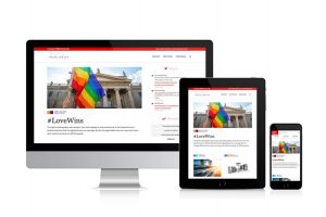
Friendship between First Commonwealth Bank and Elliance goes back a long way. In 1998, Elliance designed the bank’s second website. Since then, Elliance has redesigned the bank’s website three times – most recently three years ago before responsive design movement took off. Last fall, First Commonwealth Bank reached out to Elliance and posed an interesting […]
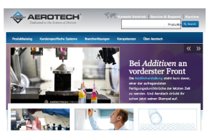
Today was a great day for Elliance, and Aerotech. We accomplished an engineering feat which is a rare occurrence in any company’s history. A little over a year after launching their English website, we launched the German version of the website for Aerotech. The intriguing part of the story is that the German website wasn’t […]
Every preschool has a point of view. All point of views are good, for some group of kids out there. But the only point of view that appeals to us as a company is the one that meets the child wherever the child is developmentally and nurtures the child’s spirit from there. Shady Lane is […]
About a year ago, I took the plunge in to grid-based web layouts. For a long time, I felt that grids were too restricting for creative design and limited your choices and direction for development. Oh how wrong I was. The use of the grids is quickly becoming a standard for rapid template generation. Designers […]
In a perpetual state of evolution, healthy organizations, like healthy people, completely reinvent themselves every seven years. In the digital era, the burden of telling the world about our current essence falls increasingly on our web presence. To treat website redesign projects as just another ordinary project is pure folly. A website redesign project is […]