Ideas, insights and inspirations.

College marketing and communications teams increasingly look to boost video teams and budgets. All well and good, but we should not overlook the enduring value and impact of your still image library. It’s easy to grow complacent and assume that last year’s photos will meet this year’s needs. It’s tempting to hire less qualified photographers, and to cram too many shots into a long day of shooting. Here are 5 Quick Tips on how to build, maintain and mature your campus photo library. Frequency: Many college photo libraries grow stale without anyone noticing. If you want to maintain a viable collection of photos, plan on four, two-day shoots each year. Story needs and brand understanding change — as do seasons, fashion, hair, and the campus environment. You will need to schedule multiple shoots each year for photos to keep pace. Quality: Staff photographers spend so much time shooting grip-and-grin, raise-a-glass campus events that few have time to hone their editorial POV … Continue reading

Posted in: , , , ,

A few weeks ago, we launched HM Insurance Group’s new website, and the same thing happened with this one that always happens—we delivered a lot more than an insurance company website design. FIRST, we engaged HM in a discovery process that revealed some business realities we didn’t expect to find. We got insights into the ways their industry is changing and the mindset of their buyers. A clear challenge emerged: How do we distinguish what “Quality” means for customers tempted to commoditize what HM brings to the table? NEXT we developed a communications strategy that addressed their business objectives, clearly distinguished their value proposition and refocused the company on the stewardship their people provide. It goes beyond the usual website strategy. It’s written to inform all of HM’s marketing efforts. AND THEN we created a new brand position for HM: “Guarding Financial Health.” These 3 words communicate the higher purpose of their B2B product and service offering. AND THEN we … Continue reading

Posted in:

As a web designer, I walk a fine line between utility and innovation. Every day I’m challenged to create something that users will understand how to use but that’s also beautiful in a way that’s never been done before. Q: But Krystal, if it’s never been done before how will your user understand how to use it‽ A: They might not understand. And that’s okay. We’ll teach them. We’re creatures of habit and change can be scary. That’s why when Instagram changed their logo last year people lost their actual minds. (Or, for the boomers among us, when Coca-Cola thought they were doing the world a favor with New Coke in 1985 and nearly lost everything.) Doctor Heidi Grant Halvorson explains that “[People] genuinely believe (often on an unconscious level) that when you’ve been doing something a particular way for some time, it must be a good way to do things. And the longer you’ve been doing it that way, … Continue reading

Posted in:

Politics aside… what do design, branding and political experts really think of President Trump’s “Make America Great Again!” red trucker hat? Some call it the worst design of 2016, while others say it was the most hated and most loved symbol of the 2016 election. But most industry designers and branding experts agree that the hat was horrifically designed but terrifically effective. Here is a sampling of thoughts and comments from industry experts and political players on the topic of President Trump’s red trucker hat: Lindsay Ballant,  Adjunct Professor – Maryland College of Art “In a way, the fluke success of that hat was a rejection of ‘design thinking’ and ‘design strategy’ as a whole.” She added, “Designers should really think about that, because we’ve built a whole economy around that as a practice. We’ve sold ourselves on the premise that this is how things should be done.” Ballant concluded, “It should be something that designers think about. Good design … Continue reading

Posted in: ,

Much like an ill-fitting or dated suit, companies and institutions with out-dated or poorly executed identities need to be aware of the perception their identity has in the markets they serve. Does your identity still fit your organization and what it does? Does it represent who you are? Is it time for a change, and if so, how can you be sure? The best identities help to synthesize and crystallize a brand to their consumers. From cave paintings dated 40,000 years ago to digital marvels created today, it is clear that humanity has, throughout history, continued to visually create symbols to trigger an emotion, a memory, a response. The definition of identity is listed as a condition or character as to who a person or what a thing is; the qualities, beliefs, that distinguish or identify a person or thing. The importance and power of an identity cannot be understated. While brands speak to the minds and hearts of followers, an identity and its visual … Continue reading

Posted in: , , ,

Founded in 2009, Dribbble has quickly become one of the largest digital platforms for designers to show and tell, promote, discover, and explore design. With over 500,000 users, 300+ of which call Pittsburgh home, Dribbble is changing the way designers share their work, find new clients, make friends and expand their skillset. Exclusivity has been a key factor in Dribbble’s success. Borrowing terms from basketball, players must be drafted by existing members in order to upload and share their work. This maintains a level of quality among the work shared, setting Dribbble apart from other portfolio websites, like Behance, that are free to anyone with a computer and access to the internet. But Dribbble is more than an exclusive portfolio sharing resource. It’s user testimonials prove that users can, and have also: Landed dream jobs Scored new clients Found endless inspiration Received constructive feedback Made network connections And now they can acquire career training Dribbble Training is the most recent … Continue reading

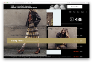
My last blog post I wrote about the future of web grids by using CSS Grid Layouts. Recently I have been finding a lot of inspiration off of the grid. Finding a way to incorporate some more organic or random elements on the page. Over the weekend I visited the home page for one of my favorite photography social media and mobile app called VSCO  and was surprised to see a very unorthodox homepage (figure 1, 2, and 3) The site looks normal at first glance, a simple nav and a list of recent blog posts, but on hover (at large desktop sizes) the post items will load images from the post behind the text in a somewhat random order and position.   The interiors are more structured (figure 4) but still give the appearance of a random placement for images and text. It is easy to keep the web in a grid structure using frameworks like Bootstrap, Foundation, or … Continue reading

Posted in: ,

This past June several Elliance team members had the pleasure of attending Web Design Day 2016. While many of the speakers presented interesting new ideas and techniques one seemed to stand out of the crowd for me, Jen Simmons’ ‘Revolutionize Your Page: Real Art Direction on the Web’. Her talk focused on upcoming web standards that will have great impact on how we design and develop web page layouts. You can watch a similar talk here. One of the most exciting features she covered was CSS Grid Layouts. What is a CSS Grid Layout? It is a browser native feature for making 2 dimensional grids on the web. In the past, after the introduction of CSS, we used tables to create layouts, this was followed by the use of floated elements and most recently we’ve been dabbling in flexbox. Of course CSS Grid Layouts are not ready for production, but Chrome, Firefox, and Opera are testing this new standard that you can use today (after … Continue reading

Design for mobile first? No way. I was in denial. People couldn’t possibly enjoy trolling the Internet more on their smartphones than through their computers. Or could they? I thought about my own habits. Wake up. Check Facebook. Go about my morning routine. Get ready to leave the house. Facebook. Drive to work. Facebook. Go into work. Work for a little while. Eat a doughnut. Facebook… It’s a vicious cycle. But what does my millennial, forever-faithful relationship with Facebook have to do with the mobile-first web experience? The answer is everything. It’s a truth I wasn’t ready to accept, but then the usership numbers started rolling in on a landing page I designed recently. Ninety eight percent of users were visiting this particular landing page on their… you guessed it… mobile devices. And there it was: concrete, matter-of-fact, absolute data that proved my thinking was completely flawed. What now, huh? What does this mean? Thanks to Facebook, (Or, no thanks to Facebook, … Continue reading

Posted in: , ,

The Problem: During development on a recent project I was tasked with creating some Front End animations for a web app. This application would present a user with a list within two tabs (the tabs will display the list by either A-Z or by Category). Within these tabs you can also filter the list, and this is where the animation exists. Items would disappear and reappear. Wanting greater control over the animation, compared to simple JQuery, I started finessing CSS animation. I quickly ran into a problem. I found that the CSS animation would re-fire/re-paint when the tabbed content came back into view. Example: Toggle between the tabs and note that the animation fires each time you return to “Tab #1” Why was this happening? I double checked my keyframe statement. Made sure I was setting animation-fill-mode to “forwards” to prevent repeating the animation. After much research and testing, I came to the conclusion that it wasn’t the CSS animation, … Continue reading