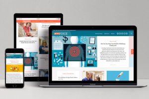
Ideas, insights and inspirations.

As the standards bearer of advanced cancer care, the Oncology Nursing Society (ONS) wanted to create a communications platform that positions them as the go-to thought leader in all matters concerning oncology nursing. To realize this goal, Elliance and ONS reinvented their online publication as an always-on, always-fresh news, views and advocacy engine, called ONS Voice. The ONS Voice includes three key innovations: First, a proprietary tagging system was developed that automatically groups the most popular articles and advocacy issues into trending topics. Second, keywords were “baked” into all articles to elevate their rankings on Google. And finally, smart forms of advertising opportunities were created to make the magazine self-sustaining and drive revenue. This association magazine website design incorporates all the learnings and smarts of the Carnegie Mellon Today university magazine we had launched last year i.e. mobile-first simplicity, stories juiced by SEO keywords, deepening of the brand, and optimal integration of digital and print. However, we went a little … Continue reading

Posted in: ,

With people relying on mobile more than ever – over half of the trillions of Google searches happen on mobile – Google recently announced changes to favor the mobile experience. Google is calling this the biggest change since AdWords launched 15 years ago, and in my 10+ years experience working in the platform, I would agree! The changes will expand the length of Google’s paid text ads. This change comes primarily with mobile in mind. When the expanded text ads become available later this year, here’s what the changes will look like in the headline and description: Ad Headline: Advertisers will now have two 30-character headlines instead of the current 25-character headline. Ad Description: One 80-character line of description copy instead of two 35-character lines! The increase in characters may not seem like a huge difference, but it is! The extended ad format will ultimately give us advertisers the opportunity to create a longer, engaging message to attract more qualified clicks. Google said … Continue reading

Posted in:

Design for mobile first? No way. I was in denial. People couldn’t possibly enjoy trolling the Internet more on their smartphones than through their computers. Or could they? I thought about my own habits. Wake up. Check Facebook. Go about my morning routine. Get ready to leave the house. Facebook. Drive to work. Facebook. Go into work. Work for a little while. Eat a doughnut. Facebook… It’s a vicious cycle. But what does my millennial, forever-faithful relationship with Facebook have to do with the mobile-first web experience? The answer is everything. It’s a truth I wasn’t ready to accept, but then the usership numbers started rolling in on a landing page I designed recently. Ninety eight percent of users were visiting this particular landing page on their… you guessed it… mobile devices. And there it was: concrete, matter-of-fact, absolute data that proved my thinking was completely flawed. What now, huh? What does this mean? Thanks to Facebook, (Or, no thanks to Facebook, … Continue reading

Posted in: , ,

Recently, we launched a landing page for Bryant University. This site asked the question “Why Bryant University?” and was completed in a tight two week turn around. Seemed like a walk in the park. It was anything but that. Thanks to our amazing design team and our thoughtful and motivated clients, Why Bryant sparks your imagination with its amazing colors, brilliant visual effects and playful interactivity.  What started out as a simple website was transformed into a story that can only be experienced firsthand. What we’ve learned As a front end developer at Elliance, it’s my job it take the ideas and visions of the design team and the client, and give life to a static mock-up. This project presented several new challenges for me, some solved more easily than others. 1. What to do with all these scripts When building this site, we wanted to create an interactive experience that keeps the user engaged from start to finish. The problem … Continue reading

Gift development officers and nonprofit fundraisers are masters of being responsive to donors. However, there’s a new type of responsive philanthropy that you might not be thinking about — responsive website design (RWD). Don’t worry. We’re not going to get technical here. What most nonprofit fundraisers recognize is the significant migration to mobile (smartphones, tablets, etc.) that’s been happening over the past five years. This migration cuts across all segments of the population from high school students and business owners to retired seniors and mega-givers. In the mGive Text Donation Study 2013, which surveyed nearly 1 million text donors, mobile donating was found to be one of the top 3 choices across all age groups when participants were asked for their preferred method of charitable giving. As a result, nonprofits and philanthropy teams need to pay close attention to how their fundraising and volunteer recruiting website(s) play on smartphones, tablets and other mobile devices. Some of you may even be … Continue reading

Posted in:

This is part 1 of my 3 part blog post about the best solution to your .edu website. Please stay tuned for the following posts. Now that nearly a quarter of web traffic is coming from mobile devices*, we’ve come to a crossroads over the best solution to a large webpage such as an .edu site. Should we build a mobile app with a sister desktop website? Or does a responsive/adaptive website make more sense? All modern solutions, at the end of the day, will get the job done for you. The question is, what is, hands-down, the best solution for your school? The first thing you need to do is forget the buzzwords and focus on your users. Do they do a lot of browsing on their devices? What is their age group? What are they looking to accomplish on your site? Your analytics should give you a lot of this information. (And if you don’t have analytics, that’s … Continue reading

Posted in: ,

Here at Elliance, we practice what we preach — sending responsive emails just as we encourage our clients to do. Our upcoming newsletter will be our first. (If you don’t currently receive the newsletter and want to check out the result, contact us with the ‘Sign Up for Newsletter’ box checked.) The importance of making websites responsive is well known — it’s been the hot topic in web design for some time now. But there isn’t as much being published about the importance of responsiveness in emails. Think about the emails you read today. What did you read it on? On your desktop email client, like Outlook or Thunderbird? On your browser using GMail, Hotmail, or corporate webmail? On your phone or tablet using a built in client? In the few hours I’ve been awake this morning, I can tell you I’ve read an email using each of these methods. I’m not an edge case when it comes to my … Continue reading

Posted in:

As Responsive Design has matured to a position of dominance in the web design and development world, so have our heads been filled with anecdotal evidence (i.e., non-evidence) about the ROI of Responsive Web Design. (Just for fun, I propose call this ROIRWD and, furthermore, that we agree henceforth to pronounce it “roy-ward”.) Now, of course the lack of empirical evidence for a thing’s existence doesn’t mean the thing doesn’t exist, and anecdotal data isn’t without its value. But it sure is helpful, when articulating the business case for a new and often more expensive approach, to have some proof that said approach is worth the cost. So I was delighted when, on Monday, developer luminary, respected author, and Polar co-founder Luke Wroblewski posted the tiny grenade below to his blog. It’s a tiny data set, but it contains some astonishing numbers. (Skinny Ties: 377.6% revenue growth on iPhone? Like a boss, as my kids say.) So I’m reposting the … Continue reading

I just returned from a vacation where I was reminded that my mobile apps are only as good as my cell provider’s data coverage. Before heading out on vacation, I downloaded a very popular trails app because it had great location information: a compass plus your latitude and longitude, weather, wind, sunrise and set, and best of all, elevation. The only problem with the app was that I tried to find my elevation on a mountain trail that had no coverage, and the app requires location services to work. And naturally, location services depend on having coverage. I was essentially offline at the very moment I wanted to use the app. I’m sure that there are millions of trails all over the world with strong voice and data coverage, but I suspect there are just as many without. If I were the app designer, what could I have done differently to make using the offline app more meaningful? Would I … Continue reading

Posted in: ,

This morning I was reading a post on the Travel 2.0 Blog that hit home. Troy Thompson wrote: “Recently, I was asked to critique changes to an advertising campaign from a well-known tourism destination. While the creative was fine…amazingly not touting anything and everything…the call to action seemed, cluttered. Perhaps that was because it featured not only the traditional website address and phone number, but also icons for Facebook, Twitter, YouTube, a blog (disguised as an RSS icon that few will understand) plus a QR code.” Seven calls to action in one print piece! Thompson points out that watering down a strong call to action with six “extras” doesn’t provide more choice, it muddies the water for the user and scrambles your metrics. This lesson isn’t just for print. On websites, there’s a tendency to offer everything to everyone at all times. Take the typical higher education website, for example. There’s usually semi-permanent placement of calls to action for applying, … Continue reading