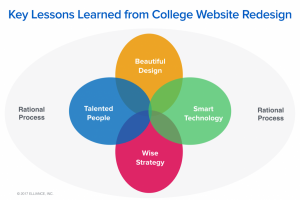
Ideas, insights and inspirations.

While all .edu websites send important signals and establish vital threads of connection to stakeholders — corporate recruiters, research partners and regional funders/allies — a business school website does so with greater urgency and a far more explicit mandate. We held that truth close as we set about redesigning a new website for the Boler School of Business at John Carroll University, a longstanding pillar of a Cleveland and Northeast Ohio economy that has seen more than its share of challenge and has responded with its distinct brand of resiliency. Through economic cycles of growth and decline, and a steady re-mixing of Cleveland’s regional economy from traditional manufacturing to financial services and, increasingly, medical technology, Boler graduates have provided a steady and reliable source of corporate leadership and entrepreneurial grit. But as is the case with many small and mid-sized colleges, the Boler School of Business struggled to articulate a strategy for strengthening the ties that bind a region’s economy … Continue reading

Posted in: , , ,

The web is full of designs and patterns, both good and bad, new and old. At times it all starts to blur together and the sites start resembling one another. Periodically I like to see what else is out there, to see what interesting ideas have yet to become the web trend of the month. The following is a small list of sites I try to visit at least once a week. As a front end developer I might be looking for something different for inspiration compared to a designer or UX specialist. The following sites will offer not only design and development ideas but also challenge the way we view content on the web, for better or for worse. Site Inspire : Well organized collection so you can easily browse for specific subjects or styles that you are looking for. Mostly leans toward a clean, modern design aesthetic. One Page Love : Single page sites only, great source for … Continue reading

Posted in:

Read about the thinking behind the association magazine website design including strategy, design, interactive technology, and integrated advertising that is powering the news, views and advocacy engine for Oncology Nursing Society.

Continue reading

Posted in: ,

In December of 2016, Slate.com started testing a new article site design. One of their designers Jason Santa Maria tweeted their test page, along with a  blog post introducing the new design approach. The new layout was sleek and simple, but I was personally drawn towards the articles hero image and title. The hero section refers to the top section of the page, usually with a large eye catching image and title. I wanted to talk about section and some of the smart design decisions that were made by Slate when thinking and designing ‘mobile first’. For publications like Slate, mobile traffic makes up a majority of their page views, so focusing on this experience is an obvious choice. Traditionally, the standard hero image is usually wider than it is tall to match the aspect ratio of the desktop device. This ‘desktop first’ approach when scaled to a mobile screen size through responsive development yields a rather short image that … Continue reading

Posted in: ,

Anyone who has ever suffered through a migraine knows the symptoms: headache, distorted vision, irritability, dizziness, nausea, etc. Anyone who has ever gone through a website content migration has probably experienced some of these same symptoms. Whether we all like it or not, in the world of digital media content migration is a necessary evil. Actually, strike that, it is a necessary good. Without the ability to perform a migration, all content would have to be manually copied from the current content management system (CMS) or entered manually into the new system. As with migraines, the key to a headache-free migration is prevention. The most important preventative steps are to understand: how your content is represented in the source system; how you would like it represented in the destination system; and how you will you need to process or transform the content while moving it. Once you have defined these three points in detail, you have essentially defined your migration path. We recently … Continue reading

Posted in: ,

Three recurring themes that our clients have shared with us after 1-2 years of their website redesign are…

Continue reading

Posted in: , , ,

Derek talks about how moving elements off the grid on a website design can inspire you to reach outside of the box on your next project.

Continue reading

Posted in: ,

This past June several Elliance team members had the pleasure of attending Web Design Day 2016. While many of the speakers presented interesting new ideas and techniques one seemed to stand out of the crowd for me, Jen Simmons’ ‘Revolutionize Your Page: Real Art Direction on the Web’. Her talk focused on upcoming web standards that will have great impact on how we design and develop web page layouts. You can watch a similar talk here. One of the most exciting features she covered was CSS Grid Layouts. What is a CSS Grid Layout? It is a browser native feature for making 2 dimensional grids on the web. In the past, after the introduction of CSS, we used tables to create layouts, this was followed by the use of floated elements and most recently we’ve been dabbling in flexbox. Of course CSS Grid Layouts are not ready for production, but Chrome, Firefox, and Opera are testing this new standard that you can use today (after … Continue reading

As a Front End developer, my job crosses over many disciplines, but this post is not about what a Front End developer/designer does (you can read a great article by Brad Frost on the topic to understand more about this balancing act). During the development of a web site, the front end plays key roles throughout the process. Traditionally the front end was reserved for the post-design states of a project, but more and more, we are seeing the front end discussed and thought about earlier. Depending on the organization or team, the front end can be introduced as early as the beginnings of content strategy, site map development, or wireframing. These early front ends are usually grayscale websites with placeholder images and Lorem Ipsum text. The ‘polishing’ of a site with elements like color, drops shadows, gradients, and animations are usually reserved for later. But recently I have found myself adding more and more motion throughout all stages of … Continue reading

Posted in:

Experiencing the power of computers used to mean being tethered to desktop “towers” or large clunky “lap”tops. Now that same power sits in your pocket, or it is wrapped around your wrist. In the last decade, computers have continued to get smaller, cheaper, and faster. And this trend isn’t slowing down as computing power is moving into other areas. We now have the Internet of Things and the power to connect to TVs, household appliances, locks, garage doors, lights, and a number of other devices. We have systems that monitor our furnace and the air quality of our house. It’s amazing. But as amazing as this hardware is, the real power lies in the software powering these devices. That is where the magic actually happens. It’s the software that gives us access to these devices. Think about all of the things that we can do now because of the software. Here are a few to get you thinking. You can: … Continue reading