Derek talks about how moving elements off the grid on a website design can inspire you to reach outside of the box on your next project.

Derek talks about how moving elements off the grid on a website design can inspire you to reach outside of the box on your next project.
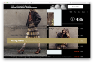
This past June several Elliance team members had the pleasure of attending Web Design Day 2016. While many of the speakers presented interesting new ideas and techniques one seemed to stand out of the crowd for me, Jen Simmons’ ‘Revolutionize Your Page: Real Art Direction on the Web’. Her talk focused on upcoming web standards that […]
As a Front End developer, my job crosses over many disciplines, but this post is not about what a Front End developer/designer does (you can read a great article by Brad Frost on the topic to understand more about this balancing act). During the development of a web site, the front end plays key roles […]
Experiencing the power of computers used to mean being tethered to desktop “towers” or large clunky “lap”tops. Now that same power sits in your pocket, or it is wrapped around your wrist. In the last decade, computers have continued to get smaller, cheaper, and faster. And this trend isn’t slowing down as computing power is […]
Touch devices have quickly overtaken traditional mouse and keyboard devices (device sales, mobile usage). The current landscape is such that we can confidently assume our visitors will be experiencing our web pages on their phones first and then on their desktops second… if we are lucky. The tricky thing is, when we speak of touch […]
As discussed in a previous blog post, we recently redesigned the Carnegie Mellon Today online magazine. With this redesign, the focus changed from a print-based quarterly issue to an online-only site with new stories both produced and promoted on a weekly basis. With roughly 80% of existing site traffic coming to articles (a number that […]
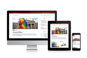
Why relaunch the online Carnegie Mellon responsive university magazine when it was relaunched just two years ago? Two reasons: big data & branding.
When I was a child, I was fascinated by the PBS show The Woodwright’s Shop. If you haven’t seen the show, the host Roy Underhill makes amazing projects out of wood using manual hand tools. A significant portion of the show featured Mr. Underhill crafting his own tool to aid him in upcoming projects. For […]
Over the past few years, the web industry has been very focused on devices. So much so that responsive design is defined as “building web content that shows up well on any device.”But focusing on devices isn’t enough anymore. By focusing only on devices, we are missing other experiences. Our web content is no longer […]
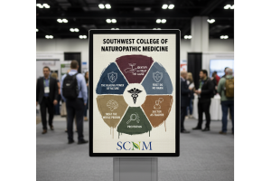
Elliance is proud to launch the first responsive website for naturopathic medicine in North America for Southwest College for Naturopathic Medicine (SCNM). By outsmarting the competition and with its history of firsts, SCNM has once again proven that it is indeed the most innovative college for naturopathic medicine. The entire process of launching the website […]