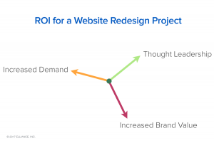
Ideas, insights and inspirations.

In working with over 100 colleges in the last 25 years, we have learned that website projects are a means for transforming an organization — Power structures are realigned, organizations are energized, inflection points are created, organizational trajectories changed, and destiny becomes more attainable.

Continue reading

Posted in: , ,

As part of a recent web design project for Highmark Insurance company we baked in SEO thinking into the structure, experience and content of the website.

Continue reading

Posted in: , , ,

The web is full of designs and patterns, both good and bad, new and old. At times it all starts to blur together and the sites start resembling one another. Periodically I like to see what else is out there, to see what interesting ideas have yet to become the web trend of the month. The following is a small list of sites I try to visit at least once a week. As a front end developer I might be looking for something different for inspiration compared to a designer or UX specialist. The following sites will offer not only design and development ideas but also challenge the way we view content on the web, for better or for worse. Site Inspire : Well organized collection so you can easily browse for specific subjects or styles that you are looking for. Mostly leans toward a clean, modern design aesthetic. One Page Love : Single page sites only, great source for … Continue reading

Posted in:

In numerous cases, we as marketers ask those we are marketing to become the voice of the company or institution they represent. Their stories give meaning in a deeply personal way. And, in many cases, we ask those that give voice to the story to be photographed to represent their story. Nine times out of ten, these subjects are uncomfortable, wary, and uncertain about their image being used, knowing their likeness will be seen by every visitor that comes to the website. Most people are simply uncomfortable being in front of a camera. So, the challenge for the designer becomes, ‘how do I represent these individuals in the most respectful and truthful manner?’ The environmental portrait The environmental portrait is just as it says — a photo that represents the subject in their natural environment. Whether it is in their work location, personal home, or a location that is representative of the narrative, the choice to shoot an environmental portrait … Continue reading

Posted in: , ,

A few weeks ago, Elliance launched HM Insurance Group’s new website, and as we always do, we delivered a lot more than an insurance company website design.

Continue reading

Posted in:

Krystal Duke walks a fine line between utility and innovation in website design, creating something new that’s never been done before that users will understand.

Continue reading

Posted in:

Take a look at a new digital magazine design created by Elliance, and learn more about their content classification process.

Continue reading

Posted in:

Read about the thinking behind the association magazine website design including strategy, design, interactive technology, and integrated advertising that is powering the news, views and advocacy engine for Oncology Nursing Society.

Continue reading

Posted in: ,

In December of 2016, Slate.com started testing a new article site design. One of their designers Jason Santa Maria tweeted their test page, along with a  blog post introducing the new design approach. The new layout was sleek and simple, but I was personally drawn towards the articles hero image and title. The hero section refers to the top section of the page, usually with a large eye catching image and title. I wanted to talk about section and some of the smart design decisions that were made by Slate when thinking and designing ‘mobile first’. For publications like Slate, mobile traffic makes up a majority of their page views, so focusing on this experience is an obvious choice. Traditionally, the standard hero image is usually wider than it is tall to match the aspect ratio of the desktop device. This ‘desktop first’ approach when scaled to a mobile screen size through responsive development yields a rather short image that … Continue reading

Posted in: ,

Three recurring themes that our clients have shared with us after 1-2 years of their website redesign are…

Continue reading

Posted in: , , ,