| May 12, 2023
Higher Education Marketing Agency Best Practices: Creating Impactful Paid Landing Pages

At Elliance, a Pittsburgh-based digital and paid marketing agency, we create unique landing pages for each of our higher education marketing clients as part of our paid digital campaigns. Along with distinctive elements for each landing page which give it an individual flavor, there are common features which consistently work very well in attracting and engaging prospective students.
Here are some best practices that we follow when creating these higher education paid landing pages for our clients:
Clear and Concise Argument Construction:
The argument construction for each landing page depends on the client’s situation and target audience. We consider who we are trying to attract, such as undergraduate students, adult students, first generation students, or graduate students, etc. A one size fits all approach does not work.
Examples of landing pages from 3 of our clients which show how different audiences are addressed:
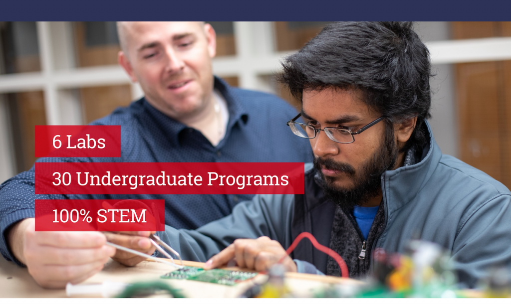
Maker Culture at Capitol Technology University:
The culture at Capitol Technology University is focused on providing a real-world, hands-on education to students. They attract students who are interested in hands-on learning such as working on projects in labs, making their own robots and creating their own gadgets. In the landing page that we created for this client, we used this as a cornerstone for our strategy for attracting right-fit students:
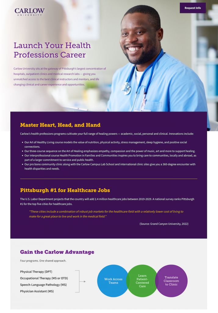
Attracting Graduate Healthcare Students at Carlow University:
Carlow University’s newly created Graduate Health Science Programs would fill the region’s demands for healthcare professionals. Elliance created a landing page which would help get more students into these programs, eventually creating a pipeline into Pittsburgh’s healthcare job market. The landing page makes the case for graduate health science education and Carlow’s central location with accessibility to top hospitals in Pittsburgh:
Creating Inspired Futures at John Carroll University
John Carroll University in Cleveland, Ohio is a Jesuit Catholic university focused on inspiring students to excel in learning, leadership and service. Elliance created a landing page which would drive right-fit prospects to this page and make the case for a Jesuit inspired education.
Strong Calls to Actions:
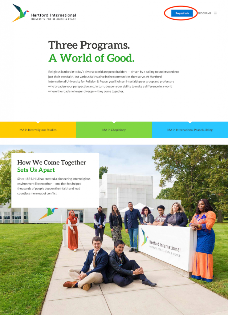
Providing a clear intent as to what you want the prospect to do is an extremely important feature of each landing page. Many of the pages we create are lead generation landing pages, so we include a clear “Request Info” button to make it easy for the prospect to fill out the client-specific request information form. Each landing page provides call to action buttons at the top which persistently follow as you scroll down the page so they are never out of sight for the user.
Example of clear and persistent calls to action on a lead generation landing page:
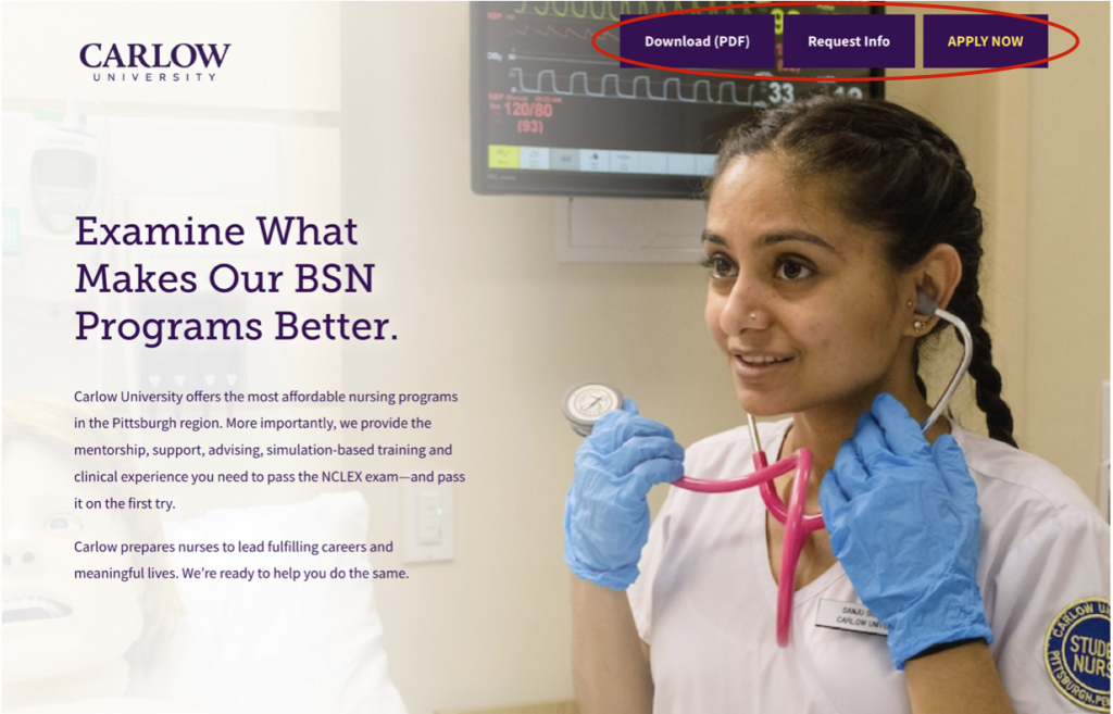
Depending on the client situation, we add different calls to action. In the example below, we added ‘Apply Now’ to encourage applications as well as ‘Download PDF’ which was a giveaway that was created specifically for Nursing prospective students.
We have also created landing pages for completely different purposes such as improving the yield. In that case, the clear call to action would be to convince the prospect to complete their deposit as the next step and get ready to enroll.
Simple Forms:
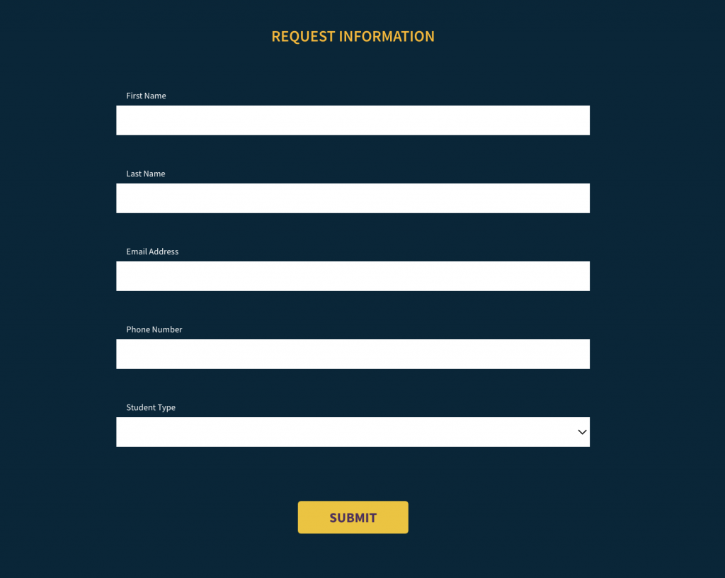
The form used on the landing page depends on where your prospects are in the marketing funnel. But, a rule of thumb is to use simple forms with as few fields as possible so that the prospect doesn’t hesitate to provide that information. On lead generation landing pages, a simple form asking for the prospect’s name and email helps get the essential information to begin communication with the prospect.
Example of a simple lead generation form:
Testing out where the placement of the form will work best is a good idea as each situation will be different.
Example of form placement testing in the middle of the page:
Proofs & Success Stories:
Showing success stories of how alumni have benefited after getting their education is a great way to encourage prospects to take the next step. This becomes a really important aspect of our landing pages where we show proof points of how an education from the college or university have enabled the alumni to prosper.
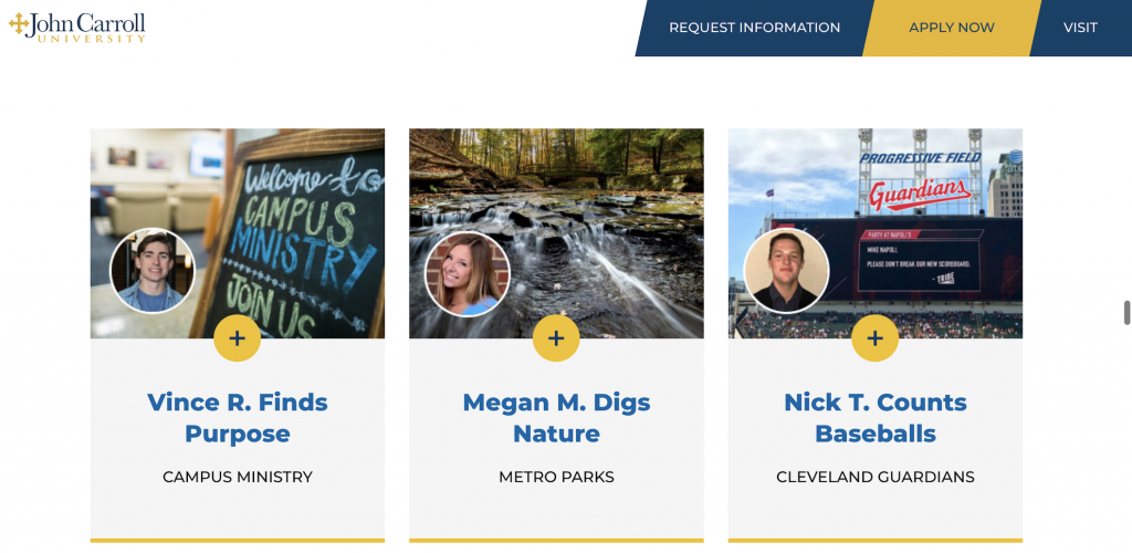
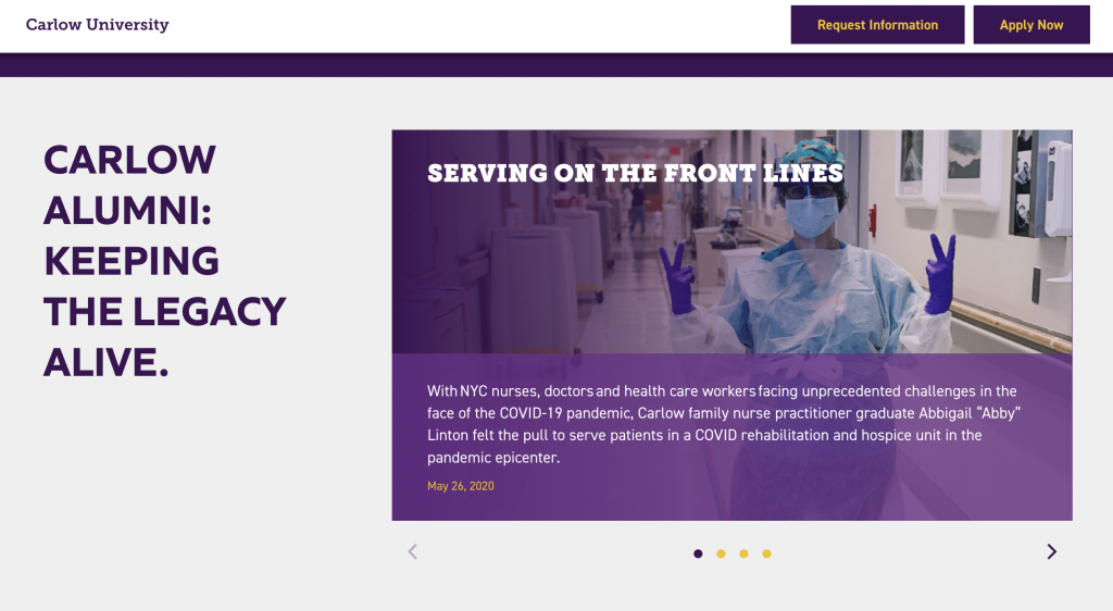
Examples of adding alumni stories on two separate landing pages:
The first example shows the student’s name and where they work and a pop-out when the plus is clicked to read deeper into the student’s story.
This second example shows an image and blurb about the alumni, with a slider to showcase 4 different stories that prospects can scroll through for more information:
A/B Testing:
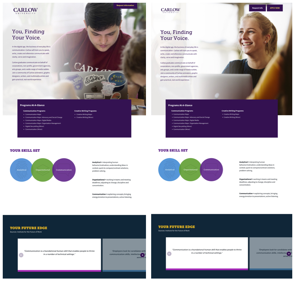
Testing headlines, copy, messaging, images, calls to action, form fields and placements can all help your landing page continuously reach your audience and allow you to learn from their behavior how best to communicate with them.
Examples of image testing used on one of our landing pages:
If you are seeking a paid advertising agency for your higher education institution, view our work with many higher ed clients and consider partnering with us.


