| Mar 10, 2017
Is it time for a new suit?

Much like an ill-fitting or dated suit, companies and institutions with out-dated or poorly executed identities need to be aware of the perception their identity has in the markets they serve. Does your identity still fit your organization and what it does? Does it represent who you are? Is it time for a change, and if so, how can you be sure?
The best identities help to synthesize and crystallize a brand to their consumers.
From cave paintings dated 40,000 years ago to digital marvels created today, it is clear that humanity has, throughout history, continued to visually create symbols to trigger an emotion, a memory, a response. The definition of identity is listed as a condition or character as to who a person or what a thing is; the qualities, beliefs, that distinguish or identify a person or thing. The importance and power of an identity cannot be understated.
While brands speak to the minds and hearts of followers, an identity and its visual essence resonate with the senses.
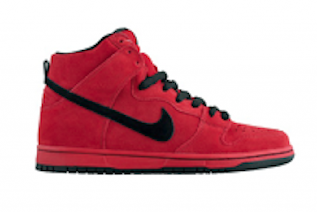
Company: Nike
Designer: Carolyn Davidson
Created: 1971
What it represents: Symbolizes the wing of Nike, Greek goddess of victory.
Back story: The designer used tissue paper to see if the identity designs she was creating looked good on the shoes she was designing it for.
Still in use.
When is a new identity needed?
The items listed below are a few of the reasons why a company or institution would want to invest in creating a new or revitalized identity. Changing your identity is both a time and financial commitment, and requires patience and diligence. But, much like that hand tailored suit, a good fitting identity will be worth the effort. If you consider the lifespan of a great, well done identity, the investment does pay off over time and will serve you well into the future.
Is it time for a change?
- The name of your company changing
- There is a trademark conflict with your existing identity
- Your identity has a negative meaning in new markets being served
- Your identity is misleading or confusing
- Your company is merging with another
Is your current identity dated?
- Your current brand needs to be revitalized
- Your organization is no longer in the business in which it was founded
- Your identity does not resonate with expanding market reach
- Your identity no longer appeals to target audience(s)
Does your identity hold up?
- Your identity does not hold up when compared to your competition
- Your identity lacks visual consistency across applications or mediums
- Numerous versions of your identity were created over time thus fracturing its integrity
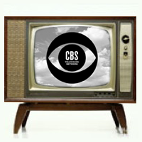
Company: CBS
Designer: Bill Golden
Created: 1951
What it represents: An eye
Background: This design was specifically created to hold up well on television screens, a relatively new medium at the time in which it was created.
Still in use.
A new identity will empower your brand.
When you think of the identity’s reach (global), its many uses (print, digital, textiles, signage and so on), and the audiences it serves (internal, external, partners, buyers, donors, and so on), it’s clear to see that the investment will reap benefits. Once you have invested in a new identity, and, if you have selected a reliable partner to create your new identity, it will have the potential to empower your brand and all those who are affected by and connect to your brand.
Here’s what a new identity can do:
- Connects all of your constituents under a singular “flag”
- Will build equity for and throughout your organization
- Provides visual consistency across all mediums and channels where your brand is seen
- Builds confidence
- Authentically represents who you are
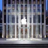
Company: Apple
Original Designer: Rob Janoff
Rainbow apple created: 1976; Monochromatic apple created 1998
What it represents: Knowledge
Background: The original rainbow designed apple was created to help humanize the company. The color bands were later dropped to enable the identity to hold up better across multiple applications and products, and it was less expensive to reproduce. The bite in the apple shape was included so it looked like an apple and not a cherry.
Still in use.


