In order for a web page to be successful, a user must visit the page. Getting a user to visit the URL is a great struggle, but after they make that decision there are dozens upon dozens of reasons why they will leave, and sometimes leave before you can get a chance to make an […]
Thoughts from Derek Palladino
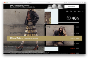
The web is full of designs and patterns, both good and bad, new and old. At times it all starts to blur together and the sites start resembling one another. Periodically I like to see what else is out there, to see what interesting ideas have yet to become the web trend of the month. […]
In December of 2016, Slate.com started testing a new article site design. One of their designers Jason Santa Maria tweeted their test page, along with a blog post introducing the new design approach. The new layout was sleek and simple, but I was personally drawn towards the articles hero image and title. The hero section […]
Derek talks about how moving elements off the grid on a website design can inspire you to reach outside of the box on your next project.
This past June several Elliance team members had the pleasure of attending Web Design Day 2016. While many of the speakers presented interesting new ideas and techniques one seemed to stand out of the crowd for me, Jen Simmons’ ‘Revolutionize Your Page: Real Art Direction on the Web’. Her talk focused on upcoming web standards that […]
As a Front End developer, my job crosses over many disciplines, but this post is not about what a Front End developer/designer does (you can read a great article by Brad Frost on the topic to understand more about this balancing act). During the development of a web site, the front end plays key roles […]
The Problem: During development on a recent project I was tasked with creating some Front End animations for a web app. This application would present a user with a list within two tabs (the tabs will display the list by either A-Z or by Category). Within these tabs you can also filter the list, and […]
As a front-end web developer I deal with Design, User Experience, and User Interface challenges on a daily basis. I also have my fair share of opinions on what works and what doesn’t work in UI/UX design. Sometimes I am wrong, and recognizing that you are wrong is the first step towards progress. The following […]
Touch devices have quickly overtaken traditional mouse and keyboard devices (device sales, mobile usage). The current landscape is such that we can confidently assume our visitors will be experiencing our web pages on their phones first and then on their desktops second… if we are lucky. The tricky thing is, when we speak of touch […]
When I was a child, I was fascinated by the PBS show The Woodwright’s Shop. If you haven’t seen the show, the host Roy Underhill makes amazing projects out of wood using manual hand tools. A significant portion of the show featured Mr. Underhill crafting his own tool to aid him in upcoming projects. For […]