| Nov 3, 2024
Why Brands Refresh Their Identity – 7 Case Studies

Brands refresh their identity to keep pace with an ever-changing world while holding onto the essence that made them resonate in the first place. Practically, it’s a renewal rooted in strategy—responding to emerging markets and shifting customer needs, technological advances, and competitive landscapes. Here are seven stories of brands which chose to refresh their identity:
Communicate Organizational Growth and Evolution
As brands expand, add new products, or enter different markets, a refreshed identity reflects these changes and positions the brand as a forward-thinking, evolving organization.
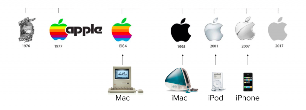
Apple is the perfect case study of such an identity evolution. It refreshed its identity as it launched its pioneering Mac, iMac, iPod and iPhone product lines. Growth in revenue followed.

Modernize Visual Appeal
Visual trends in branding lean toward minimalism, clarity, and customer-resonance. A refresh simplifies and modernizes visuals to stay current and accessible to prospects and customers.
Capitol Technology University aspired to become a leader in STEM education in the Washington DC and Maryland market. It had been a part of the job-rich pipeline supplying human capital to America’s most technologically advanced government agencies and their private sector supply chains around greater Washington DC market. While many college graduates struggle to find meaningful work with their degrees, Capitol Tech provides a launch pad to a better life, especially for first generation in college students. To grow its enrollment and reputation, Capitol Tech turned to Elliance to create a new brand position, build a new website and execute digital marketing campaigns. As part of the overall marketing campaign, Elliance modernized its logo, elevating its star trek inspired icon, while magnifying “Capitol” to strengthen its ties to the nation’s capitol. The new brand has emerged as a leader in STEM education in the region. Overall enrollment has nearly doubled over a six year period.

Gain an Outsized Share of a Shrinking Market
With higher education facing a cataclysmic decline in college-bound students, increasing pressure from for-profit education providers with deep war chests, and more than 50 non-profit public universities joining the $100M annual marketing club, branding has become an essential tool for small colleges to differentiate and grow despite the headwinds.
For over 145 years, William Woods University had educated Missouri first generation in college students in a small town in mid Missouri, two hours away from Saint Louis and three hours from Kansas City. However, faith in higher education had been slowly eroding specially amongst these students. Many high school students and families have reservations about attending college, and have actively debated whether they should go straight to work or join the armed forces instead of going to college. Under the specter of declining enrollment and declining interest in college education, the leadership at William Woods called upon Elliance to turnaround the enrollment decline. Our conversations with students revealed that when they came to William Woods, they not only thrived but as alumni, they grew into fully reflective professionals. Elliance rebranded the college promising the students that they would “flourish!” if they attended William Woods. To pay off the promise of flourishing, we changed the logomark to symbolize organic growth. It worked! Undergraduate enrollment stopped declining, graduate enrollment started growing and online enrollment doubled. Students are applying to William Woods from across the US and across the world. Immediately after the brand launch, William Woods gained an astonishing 20 points in US News rankings.

Align with Updated Mission or Values
To signal a big change, you have to change something big.
That’s the guiding principle behind American Institute of Architects’ (AIA) updated brand identity, which launched back in 2020.
In 2019, triggered by the increasing threat of climate change and an ever-more-diverse potential membership base, AIA committed its full influence to eliminating building carbon emissions by 2040 and pursuing racial equity in the profession and the communities they build.
As an organization, AIA had evolved to reflect new, 21st century challenges. To achieve maximum influence and impact, AIA’s updated visual identity signals that evolution and reinforces commitment to achieving meaningful change in the built environment.
The choice of sans serif allows for the broadest range of interpretations and inclusivity, appropriate for an organization that is meant to represent a large diverse community of design professionals in the 21st century. At the same time, the typeface has a distinctive capital I, which sits in the middle of the AIA monogram, and suggests a Doric column. The new identity retains the AIA’s established color palette acknowledging architecture’s ultimate goal—to build a better world—and reminding its members that architecture is a collective activity. Two years after the new identity launch, AIA membership reached a record high with women, and racial and ethnic groups primarily accounting for the growth.

Prioritize Digital Devices
With an increased focus on mobile devices and digital marketing, brands refresh their identity to ensure cohesive and optimized visuals across websites, social media, apps, and traditional media.
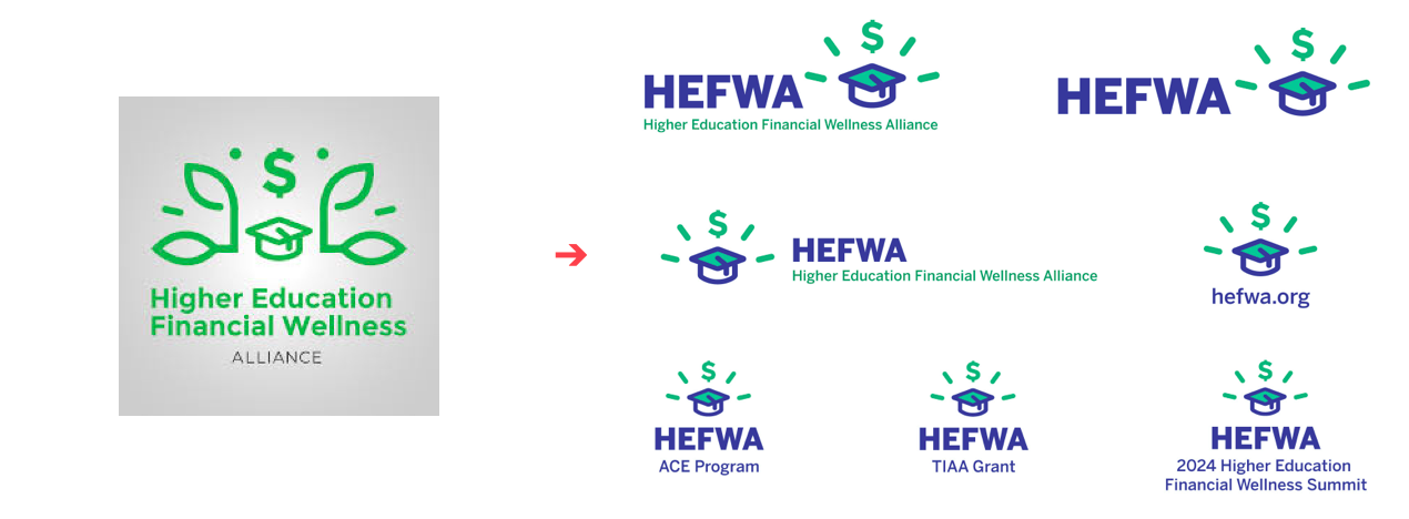
The Higher Education Financial Wellness Alliance (HEFWA), a network of professionals and institutions dedicated to advancing student success through financial wellness, came to this crossroad with a busy, vertical logo and an accessibility-challenged color palette. Elliance simplified its identity and word mark so it would work gracefully on all touch points.

Enhance Emotional Appeal and Reconnect with Target Audiences
Historically, Tupperware relied solely on Direct Sales Agents and “Tupperware parties” and has been slow to adapt to new channels and market trends. Compounding their situation is the availability of hundreds of lower-cost alternatives that closely resemble Tupperware’s offerings. The company now faces significant financial challenges and has resulted in facility closures and employee layoffs.
A crucial part of its turnaround strategy involves expanding its retail presence, which naturally required a brand refresh. The “T” in the new logo symbolizes the action of lifting a lid off a container, embodying the essence of opening or revealing. The updated identity is also enriched with a vibrant color palette, giving it a fresh and dynamic feel.

Rename an Institution
Occasionally brands have to reinvent themselves because their names have outlived their utility or their products have changed completely from their founding mission. The legendary Hartford Seminary found itself in just this position.
Due to a changing competitive landscape, persistent enrollment challenges, dependency on endowment returns to support operations, and a desire to broaden the communities it serves, Hartford Seminary had restructured its revenue model, its degrees/programs, and needed a new approach to outreach. To this end, Hartford has already begun to shift its focus from offering a diverse collection of religious studies and interfaith programming to initiatives that emphasize interreligious & peace studies education, executive and professional education, religion research with an ever expanding global & community partnerships. To reflect this transformation, Elliance renamed the university, reimagined its logo as the ascending dove, articulated a new position, redesigned its website, and launched a new blog titled “Religion & Peace”. The institution is now on the path for attracting students from across the country and across the world.
There are other reasons why brands choose to change their identity including improving perception after negatives events (Facebook), strengthening brand differentiation (Microsoft) and reflecting cultural shifts (Coca Cola).
In general, a strategic brand identity refresh is about more than aesthetics; it’s an investment in relevance, connection, and trust, ensuring that the brand’s visuals, messaging, and values resonate with both current and future customers.
If you are looking for an agency that has been liberating new growth with brand refreshes, consider contacting us.
