
| Jan 28, 2019
Intentionality and the art of great college magazine covers
The golden age of print magazines long ago expired (Time once reached 20 million readers a week at peak circulation). Still, writers, editors and photographers charged with producing a college or university magazine juggle the same risk/reward choices as their predecessors when it comes to creating memorable cover art.
Whether your college magazine comes in print, responsive or hybrid formats, your cover competes for precious reader bandwidth in an era of continuous partial attention. And if you only have one or two occasions a year to plan, design and deliver a great cover, all the more reason to be very intentional in your approach.
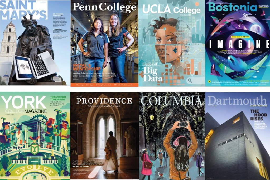
Some university magazines approach the task with zeal and gusto. Findings from the University of Michigan School of Public Health comes to mind for its persistent good faith attempts to deliver a perfect summary of the cover story, magazine and school itself in one image/headline pairing. The team understands some overall gestalt, and consistently advances mission, reputation and brand with each issue.
Other worthy models:
- New York University’s Alumni Magazine produces consistently witty and riveting covers (Something Wild: Fall, 2016).
- Barnard College works magic with cover portraiture (Greta Gurwig, Winter 2018).
- Bucknell (Is the Dream Over: Spring, 2018) routinely punches above its weight and deploys its small staff to tackle big topics — with cover art that is accessible without becoming cliched.
One side note on portrait photos. John Berger, in his classic Ways of Seeing, explains that advertising uses portraits of successful people to convey “the happiness of being envied.”
Barnard, as mentioned, shows restraint in this regard. Even with a deep pool of celebrity to draw upon, Barnard’s editorial team understands that an alumni magazine seeks a collective reassurance, not the solitary claim to glamour bargained for in most consumer advertising.
Many college magazines shrink from the challenge of producing great cover art entirely, preferring safer, albeit less engaging routes. We’ve all seen an obligatory college magazine cover (no photo scouting required) and thought, well, the easiest choice to make is no choice at all.
College magazines and the beholder’s share
At the turn of the 20th century, art historians Alois Riegl and Ernst Gombrich observed that no image is complete without the perceptual and emotional involvement of the viewer (reader). They described the exchange as the “beholder’s involvement” or “beholder’s share.”
A century later, advances in both cognitive science (mind) and neuroscience (brain) give us a deeper understanding of the brain as a meaning-making machine, with its want to grab hold of incomplete information and complete it.
When we look at a college magazine cover, we form instantaneous responses — to faces, form, gesture, contour — while also constructing a theory about the subject, college and relationship between the two.
Given the rare, yet powerful moment that’s created by a magazine cover — even those viewed digitally — it’s worth investing creative time and resources. Few messages will linger as long with prospects, alumni, partners and donors.
Your flagship magazine has the potential to move the perception/reputation needle further, faster than any other brand signal.
Center of visual impact
As a college reporter and editor, I had the good fortune of working under the mentorship of photojournalist and picture editor J. Bruce Baumann — one of journalism’s great visual thinkers. One late night, as we hastily cut and pasted (that long ago) images into the newspaper, Baumann pulled a handful of quarters out his pocket and began covering faces. “If I can hide someone’s face under a quarter, then I can ignore any meaning in the photograph,” he said.
Let me channel Baumann and offer a few prompts to stress test any potential cover idea:
- Does the subject’s strength and energy fill the frame?
- Does the cover give equal importance to person and place?
- Do you feel the rapport between photographer and subject — does the subject refuse to let go of the camera?
- Does contrast come into play, and does it lend a dynamic energy to the cover?
- Does the cover have an emotional temperature, and does that temperature match the story or special issue it frames?
- Does the interplay between words and art invite the reader to explore truth(s) beneath the surface of the cover image?
- Will the cover image compel someone to rethink how they see or what they believe?
- Does conflict and/or complexity within the cover image engage the viewer’s primal need to make meaning?
Looking for additional inspiration? Check out these 50 magazine cover design hacks.