| Mar 21, 2013
Pinterest gets a new look
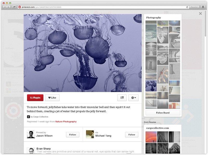
After a three-month test period with select members, Pinterest announced Monday that it will begin rolling out a new site design to the rest of its 48 million+ users.
The design changes are relatively subtle. In the newsfeed, amount of space bordering pins has been reduced to allow for larger images and a cleaner layout. Profile pages have likewise been condensed to show more pins in less space.
Easier to get around – the navigation is more intuitive
Pins are bigger and they’ve added more information related to pins, so it’s easier to find things you’re interested in.
One of my biggest pet peeves was losing my place while browsing on the mobile app. Now, when you scroll through pins and click on something that interests you, the back button lands you right back where you were no matter how far you’ve gone.
Why should Pinterest be a part of your digital marketing plan & SEO efforts?
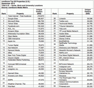
Pinterest is becoming more important on the social front. It was reported recently that Pinterest had 25m unique monthly visitors and made comScore’s top 50 web property list.
According to Mashable, Pinterest is the third-largest such network behind only Facebook and Twitter. The start-up recently closed a $120 million round of funding and is looking to expand into overseas markets such as France, Germany and Japan.
Several colleges and universities have already begun to take advantage of the opportunity on Pinterest.
Texas A&M University is showcasing their campus through one of their boards. Duke University’s Pinterest account is full of things that are fun and showcase life as a Blue Devil. Savannah College of Art and Design is using some of their boards to showcase student work, exhibitions, and events.
Pinterest is a great way to incorporate higher education branding efforts into boards that showcase culture.
Have you noticed any brands or institutions who are making impressive use of Pinterest?
Learn more about our higher education branding and social media services.


