Ideas, insights and inspirations.

Last year, web designers fell in love with minimalism. Ghosted buttons, big hero images and single page designs were just a few trends that occupied our designs. I suppose you could say that for web designers, 2015 was a year of less is more. But what are we doing now? Web designers are taking those things we loved in 2015 and building on it. We’re adding more to the less. That big hero image we loved so much? We’re making it a video gif. Those beautifully simple line work icons? We’re animating them. Oh and, that headline… we’re pulling out a set of Japanese brush pens and we’re lettering it by hand. Designers will put a bigger focus on function this year. We’ll spend more time and energy on the user’s experience filling out the form than we did in the past. We’ll start making those forms full screen and succinct for the sake of our users. We’ll put more … Continue reading

You know, the creative business is an odd bird. Anyone who has a creative bent knows what I mean. My uncle was a welder but when he came home, he was welding crazy little metal sculptures, (which later on became crazy big metal sculptures) transferring what he did at work, welding, into art… his art. The tension between mind (his working as a welder) and heart (his desire to create) did exist. At the time, I didn’t really didn’t understand how a welder could be a sculptor, but I do remember his enthusiasm for doing it. For him it fit…being a welder and an artist. An inner drive to create and to make. He resolved the tension within. Pure happiness. Oftentimes throughout my career I have been asked how we, as designers, arrive at the solutions we present. How do we arrive at solutions that speak directly to the mind and hearts of our clients. Much like my Uncle Jim, … Continue reading

Posted in: , ,

The fold. A term I hadn’t heard before coming to Elliance a little more than a year ago. If you’re sitting there clueless like I was, the fold is a term coined by the newspaper industry to describe the natural fold of a newspaper. You know, because newspapers always come folded in half. In the newspaper industry, the information above the fold is vital to sales. Since newspapers stack on the shelf at the grocery store, the stuff you throw in the top half has to be exciting enough to make readers want to purchase the paper. Sometime after scrolling was introduced to the internet (mid to late ’90s) web designers stole this term and started applying the same concept to the wonderful world wide web. Except, their thinking was that they had to cram all the important information above the fold because people simply wouldn’t scroll down, even if they had the means to do so. This may have been … Continue reading

Posted in:

I don’t like the term “UX Design” and this is why. Back in the day, when the Internet was still emerging and I was studying Design at Carnegie Mellon University, we didn’t call people “users”. We called them “people”. As designers we were taught to set our egos aside, and deeply consider the lives of those who would experience what we were designing. This is where I see an important distinction between what’s called “User Experience Design” and what I call “Human Experience Design”. In too many circumstances, UX focuses too narrowly on simply making the tool easier, instead of making lives easier. Here’s a real-world example of what I’m talking about: A person takes an online, professional certification course. At the end of the course they’re alerted that they’ve passed via email. The email takes them through a multi-step process to obtain their certification card. User Experience Designers work to make these steps easy to understand, and user friendly. … Continue reading

Posted in: ,

The Greeks called it their Muse. The Romans called it the Ingenium (the genius). I call it whatever that magic is that gets some meaningful words onto the page. Inspiration. I recently heard a great re-air of a RadioLab interview with Elizabeth Gilbert, author of Eat Pray Love. In it, she tells the story of poet Robert Frost working on a particularly lengthy and draining piece for weeks and weeks and weeks. He finally finished the thing, completely dissatisfied, even though he’d put so much effort into it. Sigh. After all that. Nevertheless, Frost woke up the next morning, and sat down to write…  “Two roads diverged in a yellow wood…” (Arguably one of the most well-known poems of the 20th century… No joke, it was last night’s Final Jeopardy! question.) It was as if Frost was being rewarded for his hard work, Gilbert says. Sometimes that’s how the creative process works. Sometimes it really does feel like 99 percent … Continue reading

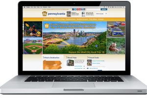
As a creative being I live for discovering inspiration all around me, and many times it’s inspiration that finds me. With fall fast approaching I think about the possibility of a road trip to take in the splendor of color that Pennsylvania has to offer, so I begin. Inspire me Pennsylvania. Step one. Visit the website.  Hmmm. The site is short on inspiration and so is my time spent on visitpa.com. Where is the story? Where is the adventure? I know our state is beautiful, so why not celebrate it with the many tools a digital experience has to offer? Mediocre = Forgettable Step two. Lolly gag So now that I am uninspired about the Pa. site, I troll around a bit online until I remember a site I saw a while ago about Maine. I believe it was an interactive newsletter? Hello Maine! What a beautiful experience. I am instantly inspired by the elegant simplicity of the user interface, … Continue reading

Posted in:

Every preschool has a point of view. All point of views are good, for some group of kids out there. But the only point of view that appeals to us as a company is the one that meets the child wherever the child is developmentally and nurtures the child’s spirit from there. Shady Lane is that special school. How would I know? Well, all my three children went there and grew in leaps and bounds during their years there. Surprisingly, the teachers challenged us as parents and we too grew in leaps and bounds as well. We were proud to design their website a few years back and now ever more proud to relaunch it by making it responsive i.e. you can now enjoy a graceful site experience on desktops, tablets and smartphones. Then And now Visit their website at http://www.shadylane.org and learn more about our website design and development services.

Posted in:

We are proud to announce the launch of a responsive web design magazine for Carnegie Mellon alumni and friends. Initially launched a decade ago before RWD was born with uncertainty about whether alumni would engage with an online version, the magazine was initially designed for desktop and laptop devices and had a smaller content management system. As the multi-device world matured and the number of users increased, the magazine was sorely in need of an upgrade, which we magically completed in a short 3 months. How did we achieve the herculean feat in a short 3 months? Four secrets. First, we reused the existing design and Sitemap instead of reinventing new ones. Second, our seasoned development team has been on a roll transforming numerous websites into responsive web design; they have worked out most of the challenges around navigation, breakpoints, image sizing, optimal page size, and other subtle issues. Third, during the initial build, we had the foresight and taken … Continue reading

Posted in: ,

Gift development officers and nonprofit fundraisers are masters of being responsive to donors. However, there’s a new type of responsive philanthropy that you might not be thinking about — responsive website design (RWD). Don’t worry. We’re not going to get technical here. What most nonprofit fundraisers recognize is the significant migration to mobile (smartphones, tablets, etc.) that’s been happening over the past five years. This migration cuts across all segments of the population from high school students and business owners to retired seniors and mega-givers. In the mGive Text Donation Study 2013, which surveyed nearly 1 million text donors, mobile donating was found to be one of the top 3 choices across all age groups when participants were asked for their preferred method of charitable giving. As a result, nonprofits and philanthropy teams need to pay close attention to how their fundraising and volunteer recruiting website(s) play on smartphones, tablets and other mobile devices. Some of you may even be … Continue reading

Posted in:

Big day! We launched a responsive web design magazine for our wonderful client, Oncology Nursing Society. They are a trade group that serves the educational, networking and information needs of 30,000 oncology nurses across the planet. The client had originally approached us to build a tablet app, which we are perfectly capable of building. However, when we heard that they would like to increase ad revenues, market share and search rankings, we steered them towards a responsive web design magazine. Here is a screen shot for your enjoyment: Click here to experience the magazine website on your favorite digital device. In the upcoming days, we will write more blog posts to share our lessons learned from this fantastic project. The responsive web design magazine paradigm is perfect for print magazines produced by alumni departments of colleges, and membership driven non-profits & trade groups.

Posted in: