Ideas, insights and inspirations.

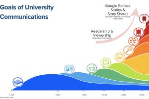
Few higher education leaders have seized the opportunity before them. Most remain in a promotion rather than a publishing mindset. And while they work tirelessly to produce content, few understand the steps to make it “productive.”

Continue reading

Posted in: , ,

Take a look at a new digital magazine design created by Elliance, and learn more about their content classification process.

Continue reading

Posted in:

Read about the thinking behind the association magazine website design including strategy, design, interactive technology, and integrated advertising that is powering the news, views and advocacy engine for Oncology Nursing Society.

Continue reading

Posted in: ,

In December of 2016, Slate.com started testing a new article site design. One of their designers Jason Santa Maria tweeted their test page, along with a  blog post introducing the new design approach. The new layout was sleek and simple, but I was personally drawn towards the articles hero image and title. The hero section refers to the top section of the page, usually with a large eye catching image and title. I wanted to talk about section and some of the smart design decisions that were made by Slate when thinking and designing ‘mobile first’. For publications like Slate, mobile traffic makes up a majority of their page views, so focusing on this experience is an obvious choice. Traditionally, the standard hero image is usually wider than it is tall to match the aspect ratio of the desktop device. This ‘desktop first’ approach when scaled to a mobile screen size through responsive development yields a rather short image that … Continue reading

Posted in: ,

In relaunching the online Carnegie Mellon responsive university magazine, we have created a technologically sophisticated online university magazine which is commensurate with the Carnegie Mellon brand. It has a singular mission: to build brand awareness for Carnegie Mellon name with people who are not aware of the brand name (“brand unawares”). Two forces are powering this new relaunch: big data and branding. Let me begin with two high-level views: Let me now illustrate the smarts behind this: 1. Data powers the entire user experience: The online magazine sections (aka departments in print parlance) are based on a combination of popular SEO keywords and CMU strategic priorities and. The story tags too are intentionally hand-picked by use of popular SEO keywords. Instead of displaying popular tags alphabetically, they are prioritized in descending popularity order, with ability for site administrators to designate a couple of tags as sticky tags based on university’s strategic priorities. 2. New interactive design deepens the brand: CMU … Continue reading

Posted in: , ,

Being a responsive web design agency, we know the importance of adding content on the web. But in app-centric world, it’s often forgotten how important content on the web really is. With the CMU Today project completed, I reflected on the benefits a responsive online magazine provides. Those benefits are directly related to what the web is for — a medium for sharing information. Here are three things you gain by making your site online and responsive. 1. Increase Social Reach – “Going viral” is every marketers dream. Right now, it’s easier than ever on the web. We live in a time of social networks, emails, and texts. Every article on CMU Today can be instantly and easily shared by its readers. Social shares allow you to tap into your readers’ personal networks. This lead to more people seeing the article and more shares by these people. Your article may not be the next viral cat video YouTube hit. But … Continue reading

Posted in: ,

As another site is launched, I’d like to take a minute to look back and see what we did right and what we could do better. This week, we launched a responsive rebuild of Carnegie Mellon Today. Doing a code re-write is a completely different creature than building a site from scratch. The design choices that were laid out with the technology at the time are still the baseline of how your code works and your limitations. At its core, Carnegie Mellon Today was a prime example of what we developers praise as a content-driven website. The layout was simple yet elegant, and the site was filled with rich content and powerful imagery. Not wanting to lose that appeal, Elliance was tasked with taking the current site and re-writing it to make it responsive. What we learned Change isn’t always easy – When working with existing content and procedures for placing said content, changing how things work on a CMS … Continue reading

Posted in:

We are proud to announce the launch of a responsive web design magazine for Carnegie Mellon alumni and friends. Initially launched a decade ago before RWD was born with uncertainty about whether alumni would engage with an online version, the magazine was initially designed for desktop and laptop devices and had a smaller content management system. As the multi-device world matured and the number of users increased, the magazine was sorely in need of an upgrade, which we magically completed in a short 3 months. How did we achieve the herculean feat in a short 3 months? Four secrets. First, we reused the existing design and Sitemap instead of reinventing new ones. Second, our seasoned development team has been on a roll transforming numerous websites into responsive web design; they have worked out most of the challenges around navigation, breakpoints, image sizing, optimal page size, and other subtle issues. Third, during the initial build, we had the foresight and taken … Continue reading

Posted in: ,

Big day! We launched a responsive web design magazine for our wonderful client, Oncology Nursing Society. They are a trade group that serves the educational, networking and information needs of 30,000 oncology nurses across the planet. The client had originally approached us to build a tablet app, which we are perfectly capable of building. However, when we heard that they would like to increase ad revenues, market share and search rankings, we steered them towards a responsive web design magazine. Here is a screen shot for your enjoyment: Click here to experience the magazine website on your favorite digital device. In the upcoming days, we will write more blog posts to share our lessons learned from this fantastic project. The responsive web design magazine paradigm is perfect for print magazines produced by alumni departments of colleges, and membership driven non-profits & trade groups.

Posted in: