| May 11, 2012
Why Won’t Devan Replace His Broken iPhone?
I have a friend named Devan. Like a lot of my friends (and a lot of your friends too), Devan has a cell phone. It’s an aging iPhone 3G. You can tell it apart from the iPhone 4 (and 4S) by its rounded edges and plastic case back. Devan’s had this phone for three years – a remarkably long time for a UX nerd to carry a phone, let alone when each successive year brings with it a flood of new features and capabilities, longer battery life, better screens, and updated styling.
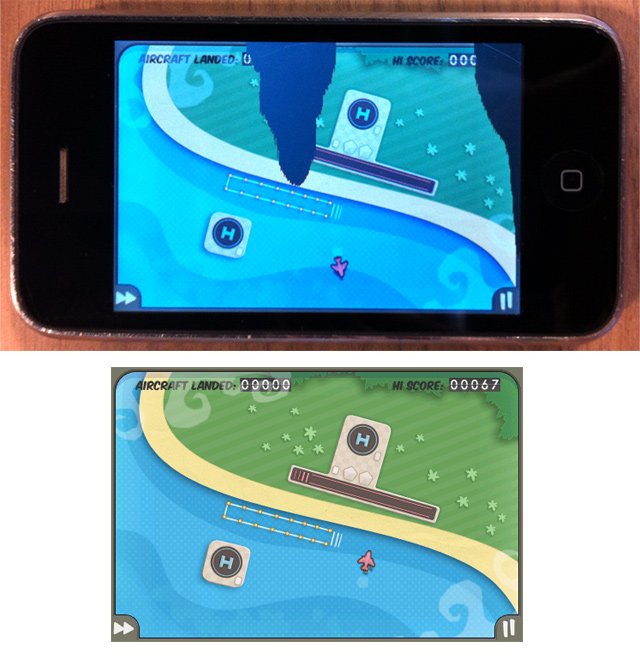
And the thing is, Devan’s phone looks like hell. He dropped it on the concrete sidewalk over a year ago, fracturing the LCD film beneath the glass in the process. The glass itself remains intact, but a good portion of the display is obscured by bleeding LCD crystals. Because of this, he can only see portions of any given app he’s using.

When he gets a new mobile app, he has to take screenshots of every screen in the app, upload them to his computer, and view them there to learn the interface, because that much of his phone’s screen is impaired. It’s a real pain in the neck to use, and I and several of Devan’s other friends have chided him for not replacing it.
“You’re a freaking user experience designer,” our friend Jay protests, “You’re the last person I’d expect to tolerate life with a broken iPhone.”
Devan is eligible for a subsidized upgrade, and he has been for over a year. He could get an iPhone 4 or 4S – the ones with the new styling and features – and have a more advanced phone and save himself a lot of inconvenience. But he isn’t interested in a new iPhone. Not the slightest bit.
And the 64 million dollar question is, “Why the heck not?”
The answer is simple and instructive and has become one of my favorite little beacons of UX wisdom: He doesn’t like how the new iPhone form feels.
With his 3GS, he can quickly discern the phone’s orientation by touch. He admits that the home button makes orientation discernment by touch possible with the iPhone 4 as well, but the home button is harder to locate than the rounded edge along the back of his 3GS. That same curve makes the phone less visible in his pocket through the fabric of his pants, and feels more comfortable in his hand when he’s on a call. That curvature means so much to Devan, that he’d rather endure headaches we might think would be unacceptable than replace it. And therein lies the reminder I love.
As UX designers, we are not our users. As observant as we can be about what makes a thing we’re designing good, it is critical that we get out of our own heads and become empathetic observers of the people for whom we’re designing.
As long as the Devans of the world are there to surprise us, we need to seek them out and let them; for theirs are the voices in the night that will keep us fully awake as we busy ourselves, feverishly dreaming up the next big thing.
