| Nov 7, 2012
A Modest iPhone 5 Observation
Because we live in the future, I wasted very little time trading in my two-year-old iPhone 4 for a shiny new iPhone 5 when it was released in September. There was nothing wrong with my old phone, but as a designer of software and websites destined to be used on the new device, I have a reasonable excuse to perform a ritual upgrade every two years.
As of today, I’ve been using the new phone for one month. In almost every way, it’s a beautiful device. It’s thin, light, fast, and handsome, yes. More importantly, the iPhone 5 preserves the vast majority of behaviors and elements of “feel” of its predecessors. As a thing like this evolves, it’s actually critical that it strike the right balance between retaining familiarity and introducing new patterns. Favor familiarity too heavily, the thing feels stale. Zoom too fast to the new, users get impatient with being required to relearn new ways of doing things where the old ways worked just fine. It’s a delicate balance to achieve, and Apple did an exquisite job this time around. The more I use the iPhone 5, the more I feel like it’s the natural completion of the adventure Apple began with the release original iPhone in 2007. It’s a device so holistically considered, almost nothing feels off. Almost.
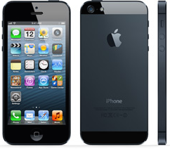
My modest observation about the iPhone 5 has to do with its new, taller, 4″ display. Videos look brilliant on it. I scroll ever so slightly less through long web pages than before. I can fit an extra row of icons on my home screen. And yes, I can read 12% more tweets at a glance than before. The problem is, my thumb didn’t grow at all when I traded up to this new thing of glory, and I now find myself fumbling to tap icons, buttons, and links in the upper-left corner of the screen. In fact, the entire top 80 pixels or so are awkwardly just beyond my reach, and I’ve had to resort to two-handed use on a device where, for years, my right hand alone sufficed.
Fitt’s law tells us that this inconvenience is more than just a physical or habitual one. Because of the greater distance I between my thumb and the sections of the screen I so desperately need to touch, I am losing time from my life whenever I use my iPhone. Yeah, the faster processor makes up for some of that, but the phone will slow as future iOS updates hog resources. Meanwhile, the seconds tick by.
So that’s it. My modest observation is that my beautiful new iPhone is quite literally wasting my life. Or, more to the point, that unexpected considerations and decisions have profound impact on the user’s experience of a designed thing – even an exquisitely beautiful one – and that the difference between perfect and almost perfect can be grave and existential to the user in ways we usually stagger to imagine.

