As a web designer, I walk a fine line between utility and innovation. Every day I’m challenged to create something that users will understand how to use but that’s also beautiful in a way that’s never been done before.
Q: But Krystal, if it’s never been done before how will your user understand how to use it‽
A: They might not understand. And that’s okay. We’ll teach them.
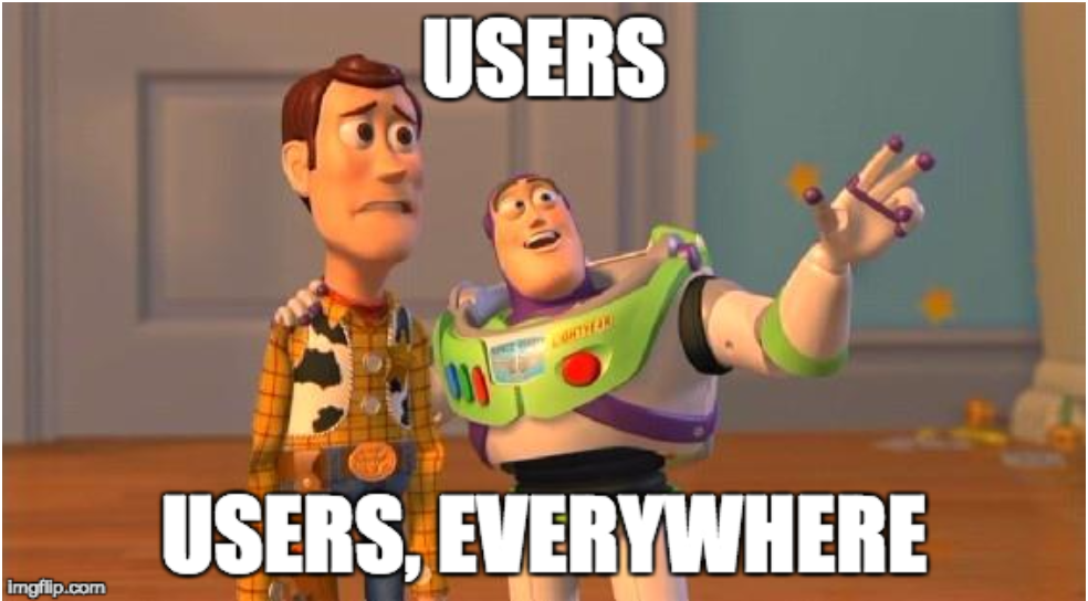
We’re creatures of habit and change can be scary.
That’s why when Instagram changed their logo last year people lost their actual minds. (Or, for the boomers among us, when Coca-Cola thought they were doing the world a favor with New Coke in 1985 and nearly lost everything.)
Doctor Heidi Grant Halvorson explains that “[People] genuinely believe (often on an unconscious level) that when you’ve been doing something a particular way for some time, it must be a good way to do things. And the longer you’ve been doing it that way, the better it is.”
Take search bars, for example. Users know how search bars work. And they expect that each time they interact with them they’re going to function the same way. This is utility.
But utility doesn’t have to mean same-old-same.
Let’s compare utility in web design to Band-Aids. The core design and function of the Band-Aid hasn’t changed since it’s invention in 1920. An adhesive strip with an absorbent center, Band-Aids are by design, very utilitarian.
And over the last 97 years, the company hasn’t modified their products much — mostly because they didn’t need to. To handle a broader range of wound dressing needs, they expanded their product line to include an array of colors, shapes, sizes and fabrics. That’s their something beautiful that’s never been done before — but for cuts and scrapes.
Search bars are like Band-Aids. They’re utilitarian. We know how the work and we desperately want them to keep working the same way. But much like the Band-Aid, there’s no rule that says all search bars must look the same way.
Over the past few years, web designers have started to play around with placement and size of search fields. See a few examples from a few higher education and other websites. It’s clear that oversized search fields are trending right now.
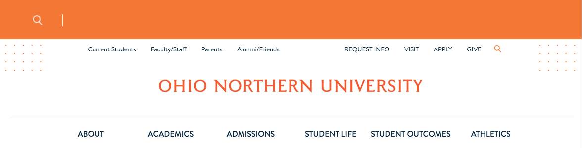
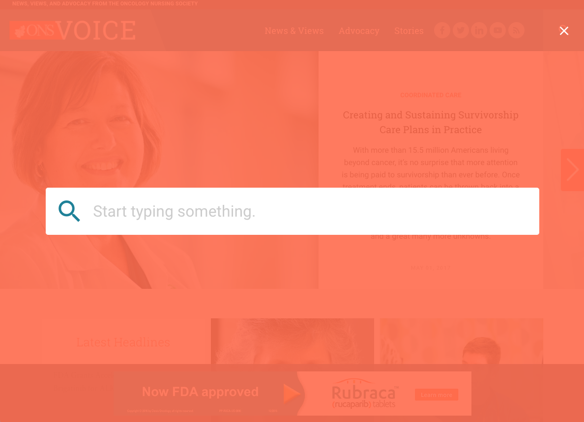
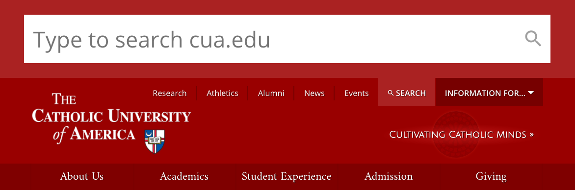
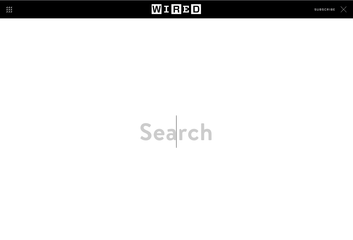
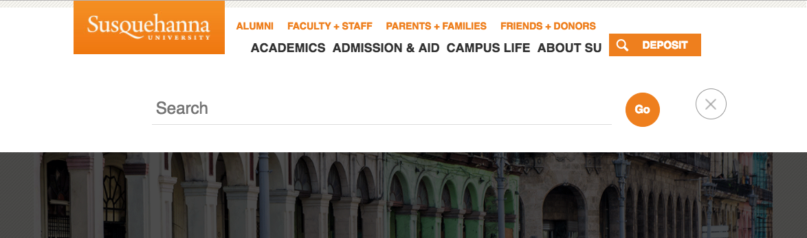
By changing the colors, shape, size or placement of the search bar, web designers have married utility and innovation in a way that doesn’t disrupt the user’s expectations, making everyone happy.
Search bars aren’t the only places that web designers are innovating utility. Check back for future innovation and utility articles.
Comments