In December of 2016, Slate.com started testing a new article site design. One of their designers Jason Santa Maria tweeted their test page, along with a blog post introducing the new design approach. The new layout was sleek and simple, but I was personally drawn towards the articles hero image and title.
The hero section refers to the top section of the page, usually with a large eye catching image and title. I wanted to talk about section and some of the smart design decisions that were made by Slate when thinking and designing ‘mobile first’. For publications like Slate, mobile traffic makes up a majority of their page views, so focusing on this experience is an obvious choice.
Traditionally, the standard hero image is usually wider than it is tall to match the aspect ratio of the desktop device. This ‘desktop first’ approach when scaled to a mobile screen size through responsive development yields a rather short image that once had a great impact on larger devices. This loss of visual impact is usually undesirable.
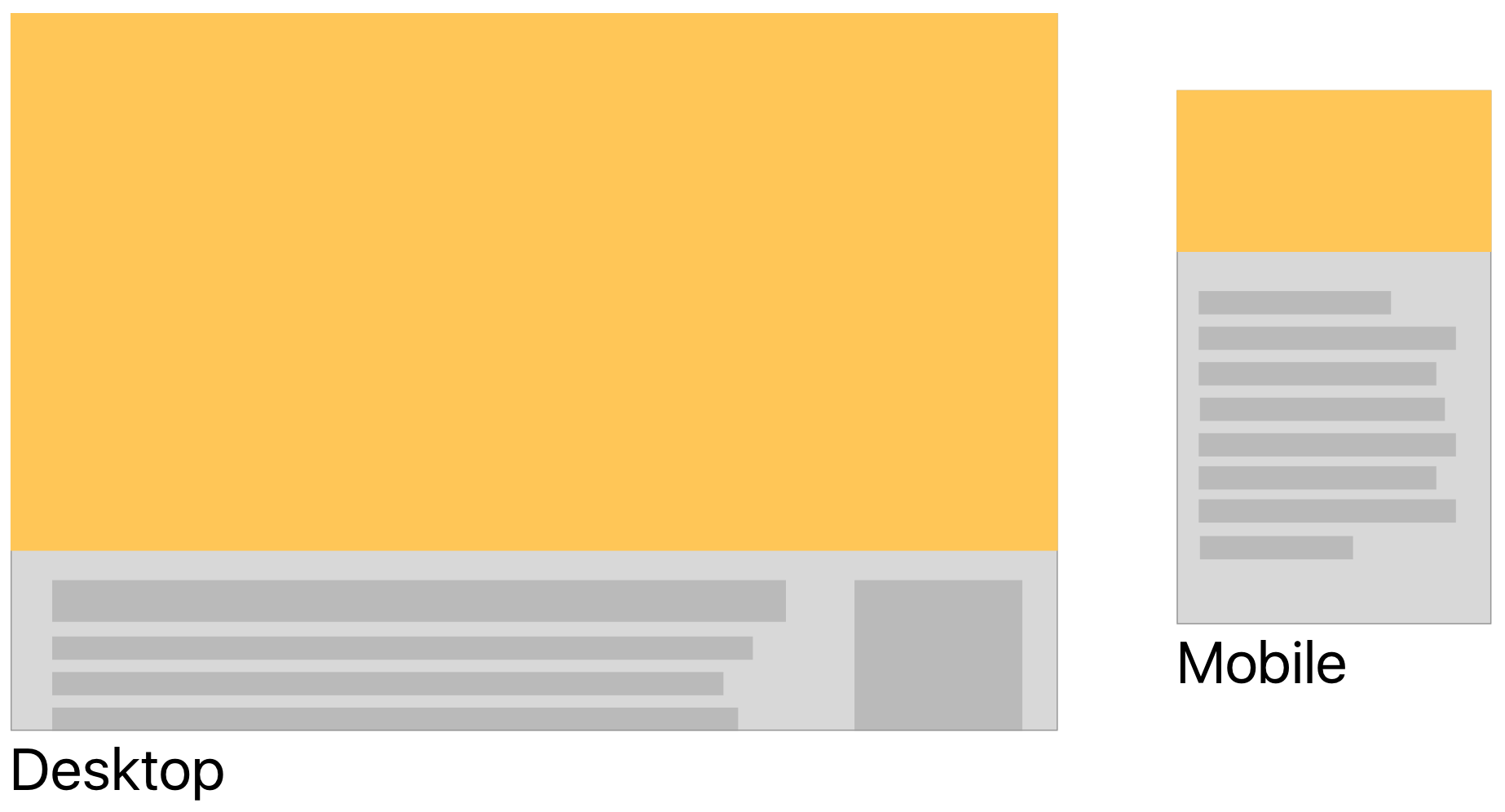
What Slate has done is to start with the mobile design, find what ratio works best for the design on a smaller device, and then designs the desktop with that image ratio in mind.
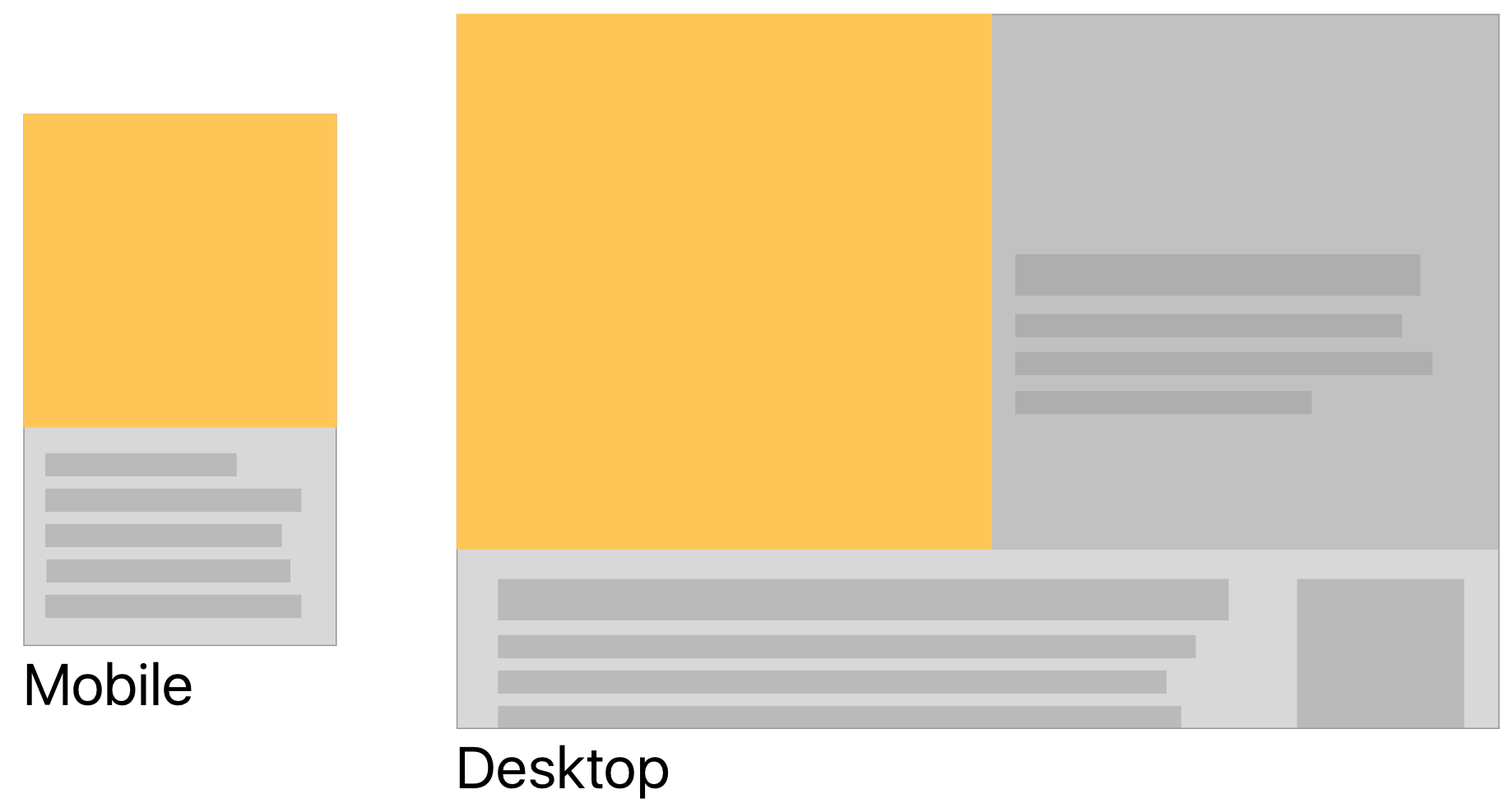
On desktop, they are moving the articles title to the right of the image, avoiding other common issues such as the title being below the desktops ‘fold’ or text floating over the image in undesirable places (ie. over a subject’s face).
Not only does this design decision benefit the visual aesthetics of the mobile sizes, but because the desktop image does not need to be full width meaning that you can use a smaller image file.
The image of Stevie Wonder Slate is using is a 885 x 900px JPEG, in the traditional hero model that image would have to be roughly 1770 x 900px and potentially doubling the data needed to load the image. For a majority of site, the largest amount of asset downloaded by the visitor is usually the images, minimizing the largest of these images will greatly increase performance, which in turn will reduce bounce rates and increase user satisfaction.
This isn’t the perfect solution, or the only solution. Responsive image, css wizardry, and future compression scripts can all be a better solution for your particular project. Slate’s layout shows that a slight design decision can not only solve visual constraints in this multi-device world, but can also improve the end user’s experience.
Comments